Something is Missing/Present
mixed media, Spring 2020 to present
It started with making a red painting for a friend. The next day, I made a green one for a community art project. And then an orange one for another friend.
A friend shared how colors were connected to our chakras, energy centers in our body as described in yoga. (Read more about chakras.) The paintings inspired me to go back to yoga after a gap of 8-10 years. The first teacher I happened to pick was a “chakra expert” and “gong master.” I had never experienced any of this when I had taken yoga before. Things had changed so much. The class experienced the vibrations of the gong which the teacher said cleared the chakras. I now saw the colors I had been painting!
Having had my first yoga class in first grade in school in Bombay, India, I realized it was never too late to learn more. I started to explore the power of colors. Why do we love certain colors sometimes and can’t stand other colors at other times? As people told me stories related to colors—stories of health issues, stories of a favorite uncle, stories of favorite jewelry—I learned that they tell me about what is missing or present in their lives.
I add to the beautiful colors another favorite thing from my past, the beautiful Devanagari script which I learned to write at a young age and then learned to make beautiful in art school. It was only in 2011 that Cecilia Kalish introduced me to water-soluble graphite and it changed my art forever! I use graphite or Chinese ink to write the letters.
As I keep working on this project with others and by myself, exploring various colors, I have added them here. I tell stories of friends and also of my own process. You will see how stories and the community inform my work. Of course, during the pandemic when no one came to the Studio, I worked on paintings that told my own story as well.
Photography: The prints of these 3D artworks, Grounding, Acceptance, and Trust, are made by Yuri Long, a photographer who has collaborated with me on projects before. I really value his eye for detail and his knowledge of process. And we share a love for color too! Check out Yuri’s work here.
Read about the artworks below. You can buy prints of Grounding, Acceptance, and Trust by visiting my shop. Thanks!
Something is Missing/Present:
Grounding
Mixed media on canvas, 2020
I created this big, bright red painting in April 2020 for a friend who had left an abusive marriage and had moved into a new apartment. Completely unsettled, she said she missed her favorite things—her red things.
I knew red was the color for the root chakra. And I knew many of her favorite things were red and that all of them were “non-essential” and thus in storage.
I went to the studio where an artist had left behind a huge painting he had created for our group show in 2018, Baked Clay/Endless Sky: 5 Years of PAUSE. The lower half of the painting had pages torn out of books hidden under layers of thick brown wall paint. The top half was thinly applied pale blue. But he had not come to pick it up after the show ended years ago. He was an art therapist so I thought it would be perfect to give his painting a new purpose!
I mixed a beautiful red in acrylics and painted the entire canvas. On that I attached a Healing Wand by artist Mary Louise Marino on a swatch of indigo hand-dyed and hand-woven fabric from Laos which she had given me. I looked up the Sanskrit syllable for the root chakra, Lam, and wrote it across the horizon in Sanskrit using water-soluble graphite and gold acrylic paint. Then I asked my friend and calligrapher Sughra Hussainy what letter in Arabic made the same sound. Turns out, its called Lam! So I added Lam in the Arabic script as well. Now it could be read by people who read many languages as the Devanagari script is used to write Sanskrit, Hindi, Marathi, Nepali etc., and the Arabic script is used to write Arabic, Farsi, Dari, etc. See more artworks from the series, below!
UPDATE: June 2024
I made another red painting in the fall of 2023 titled “Kanyadaan, Again.” When I think about this painting now, I think how the color red is the color of marriage in the Bengali Hindu tradition (as opposed to say Green in the Marathi tradition or where the Malayali brides wear white). Red is considered the color of the earth and works when you think how a woman traditionally leaves her first home to go to a new place, that of her husband’s home. You can read more on my blog post here.
I am seeing the photo of me waving the small American flag and the 13 red stripes accompany me, each representing the 13 original colonies. I have thought about how everyone who is American has or has ancestors who left their home to come here or were forced to leave their homes to come here. And how they displaced and decimated those who called this land home and how descendants of those people are now telling of the inequities. And yet the American government gives people Permanent Residency, which thousands crave. Should it feel icky? Yet, here is my struggle to actually leave my own land and accept this land as home. People and Place… I think about it a lot.
BUY Prints:
Grounding, Small, 7.5 x 10, (matted size 11 x 14): $40
Grounding, Big, 12x16, (matted size 16 x 20): $50
Something is Missing/Present: Acceptance
Mixed media on paper, 11.5 h x 11w inches
This painting is part of my Words to Art Spring 2020 project, which I was commissioned to create for Arlington Arts during the 2020 pandemic. A new version of my project Words to Art: Art on the ART Bus, where I had invited bus drivers to give me words they wanted to share with riders and which I made into art to display in the bus, this version connects with the public in a socially distanced way. Through social media we invited the public to share a word describing their feelings on each Monday over 4 weeks from April-May 2020. As they shared words, five Arlington artists picked one that spoke to them and made it into art. The art was then shared through the weekend for all to enjoy. And this is my interpretation of the word “Acceptance.”
I re-used tape from making the red painting I had made the previous day (Grounding). I added to it coats of the lush green color of spring and the heart chakra. It accepted the bumpy tape, which represented suppressed feelings we all dare not express during the unpredictable and terrifying pandemic. Yet, it also was my un-mowed lawn, filled with clover which the bees enjoyed. The syllable for the heart chakra, Yam, which I wrote in Sanskrit using water-soluble graphite and gold seem to have soaked into the earth, nourishing the green. I am okay with that. And as the tape uncurls and I see the red, I know the painting could look different every time I see it. And I am okay with that as well.
Read the full story of the artwork on the blog post here.
BUY Prints:
Acceptance, 7.5 x 7.5, (matted size 12 x 12): $40
In this optimistic orange painting, I incorporate one of my favorite motifs—a 3-D handmade paper window opening outward. Made for a friend who was finishing the paintings for her MFA thesis project, I remembered how she had found that she loved painting when she was working with the color orange. Yet, when she was not painting, her stomach hurt. I knew her story and how her dream of finishing her education had been interrupted so many times in traumatic ways. How would the story end, she wondered. Can she trust the world, I wondered. Can a color help?
I made an orange of my own, added the open window into the world, and gorgeous clouds because I know that they wash away the old and make room for the new. Orange is the color for the second chakra, which is the sacral chakra. I looked up the the syllable, Vam, and added it in Sanskrit.
BUY Prints:
Trust, 7.5 x 10, (matted size 11 x 14): $40
Something is Missing/Present: Trust
Mixed media on board, 19.5 h x16 w inches
Something is Missing/Present: Speak Up, Be Heard
“Endless Sky” wall paint from Sherwin-Williams, on canvas
When I opened Studio PAUSE, the walls were of 2 colors. The wall where anyone could show their work was the Sherwin-Williams color named Baked Clay. All the other walls were painted a color named Endless Sky. That was in 2013.
The wall colors were a version of my brand colors and people have loved them. They love the bright and colorful space. And for our Year 5, curator and PAUSEr Carson herrington asked the PAUSErs to explore what the 2 colors meant to them. She hung the works created in an exhibit titled Baked Clay/Endless Sky: Five Years of Studio Pause. That was 2018.
One December, a friend was feeling terribly depressed because she had no family to visit during Christmas. She was going to be stuck in her home and was feeling miserable. So I asked her if she would like me to come paint a wall in her living room with the blue paint of the Studio wall color. She loved the idea, and loved that blue. So I went over with some friends, and we painted and played music while our friend cooked rice and beans for our lunch. During the pandemic that wall became her background for all her virtual meetings. She loved it as did everyone who saw it. She had decorated it with art, photos, plants and more.
So she was quite miserable when she called to tell me she was moving and would miss her blue wall. But before she moved she had to paint it back to the original white. I went over again with the needed paint color and painted away the blue as she sat on her couch and cried and cried. I will miss it so much! That blue was me. It was my voice. I would speak my truth in those meetings, she sobbed. I painted and listened.
She worked as an advocate for survivors of human trafficking. I understood what that color had meant to her and how it had helped her. Had she actually said all that? It was right out of the Throat chakra chapter from the chakra book!
When I finished painting the wall I told her I had a big canvas at the studio and I could paint it blue and bring it to her new apartment. She said, “Really?” I found a location of Sherwin Williams near her and we went to buy the paint. They said there was no color named Endless Sky and my friend was about the start crying. I told them to look for something similar, something with “sky”. They found Vast Sky and it was the same color! So I bought the paint and my friend was overjoyed.
I took it to the Studio and painted a canvas with that color. My friends who helped her move took the canvas to her and sent me a photo of her standing if front of it, smiling! It would continue to be behind her when she did her virtual meetings.
She had spoken up about what she wanted. She had been heard! And I made my first painting for this series that was just the same flat wall color throughout. And I put no syllables on it though it would have been HUM.
Photo: The canvas next to the Studio wall.
Something is Missing/Present:
Self-Love
Mixed media on board, March 2021
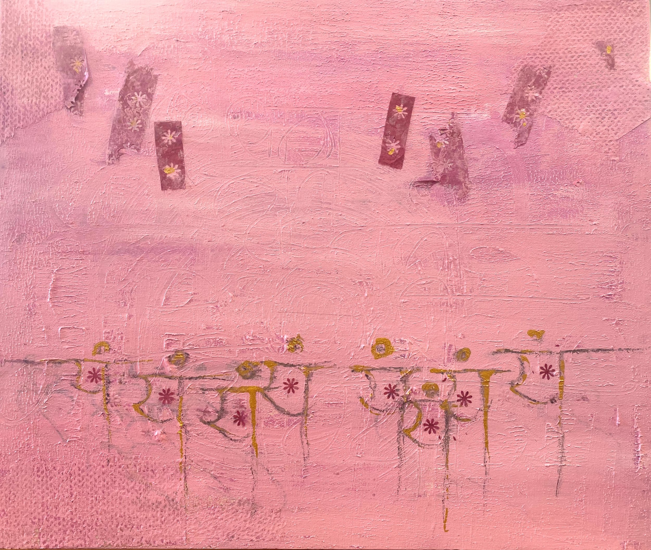
I live in Arlington, VA, so it’s not an exaggeration when I say everything is pink here during Spring. Who cares about the happy yellow daffodils when every other tree is turning pink, pinker, and pinkest! The magnolias turn pink, and all kinds of cherry blossom trees turn pink. The streets are soon strewn with “pink snow” as the petals drop en masse. Pink! Pink! Pink! Everywhere. And everyone is raving about it all!
So what happens if you hate the color? I have always hated pink. Well, that cute pink, especially. I love the darker pinks but this cotton candy pink? No thanks. Maybe it’s because I was a tomboy growing up and this pink was all girly?
It would be in March 2021 when I would see the pink magnolia petals on my neighbor’s tree and photograph their beauty in the rising sun. Later, I would photograph the mess the petals made after falling in my backyard. The two Cherry trees outside the Studio building bloomed. When I walked to the store cherry blossom trees were thick with bloom and later petals were everywhere. I took pictures but didn’t like the color, so, for that exact reason, I decided to paint it.
I made the color, painted the board, and went home. I had added bits of paper in the shape of the poetry slips, or tanzaku, which I saw on centuries old Japanese screens at the Asian Art museum where I volunteered. I love how the Japanese poets wrote poems to document their joy, longing, and the ephemeral, transient, cherry blossoms. Here today and gone soon. I also wrote the Sanskrit syllable Yam in the Devanagari script.
But acrylic paints dry dark so the next day when I saw the painting, it wasn’t the right pink. So I made a new and lighter color, and repainted the entire thing. The next day, again, too dark. So I did it again. And again, too dark. I was getting frustrated. I didn’t like the color anyway so who cares! But then a voice in my head spoke, like from far, far away. “It needs yellow.”
Yellow??
I am mostly a self-taught painter and only learned one semester of oil painting in art school decades ago. I was new to acrylics which I learned to paint with only in 2011. But I am not new to mixing color really. That voice in my head, speaking from far, far away was my art director self from my days working in the advertising industry. Then, working in the print medium, I worked with and was an expert in four color process printing. I had to check how printed materials for my clients looked and had to fix it if the colors weren’t right. Certain clients had special 5th and 6th colors overlaid on the 4 CMYK process colors (C=cyan, M=magenta, Y=yellow, and K=black). Every printable color was a mix of these 4 colors, the same we use in home printers today. Except, process colors start with Magenta as a primary and not red, like in color theory used in painting where Red is a primary color. In printing, you add yellow to magenta to make red. My pink was too dark and when I made it light using white, it was too cool. Yellow would warm it up just a bit.
I mixed in a bit of yellow and white and there it was. I came back the next day and boom! The cherry blossom pink joyfully welcomed me! I was thrilled! I was joyous. I had got the right pink—the pink my eyes saw. I patted myself on the back, especially that girl from decades ago who still knew her stuff and was good at it. :)
But then I tried to photograph it and ugh. It was a hard color to capture. Oh well.
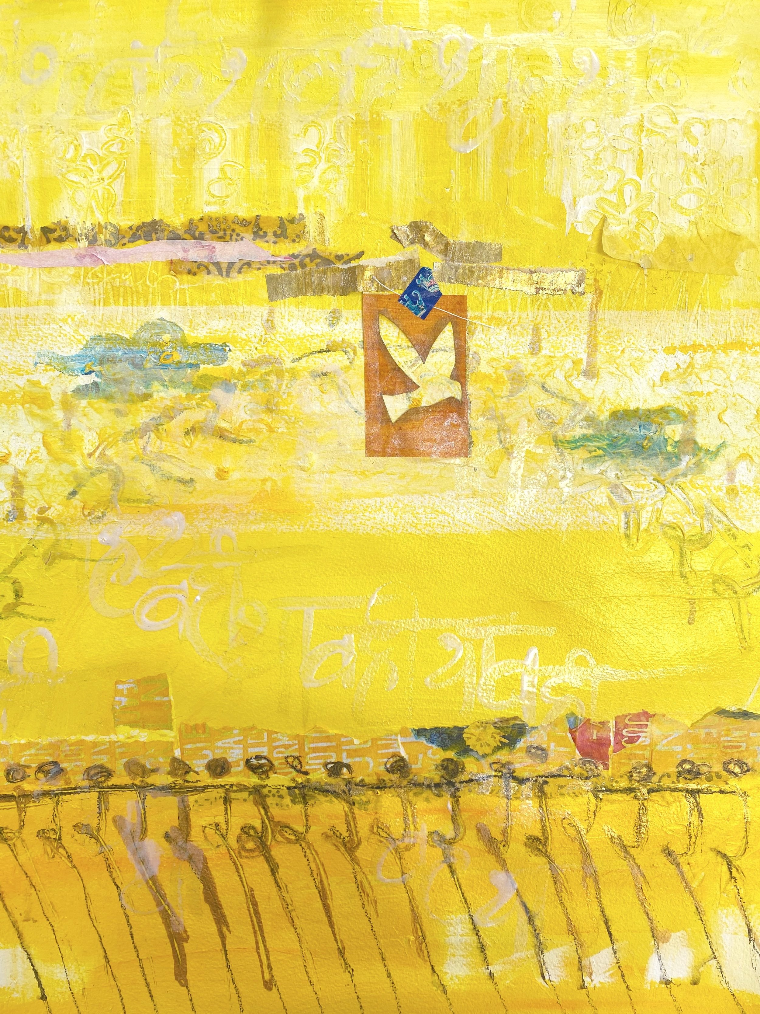
The Yellow painting was not working. I had been drawn to many yellows and had painted them, collected bits of yellows in other media, painted over it all, glued more stuff sown, painted some turquoise (why this combination again?), written the syllable Rum, but still nothing seemed to work. But I kept the painting nearby. Because you never know…
Others who came to the Studio asked me about it. How was it going? Nothing yet, I would reply. They would see it. Yeah, it was the same as before… Until August 2022.
I had been commissioned by a friend to make a painting for her. She wanted me to ponder on the Sanskrit word Prana or Breath. She sent me some related verses from Indian scriptures, and so I read them. There was something about a bird… breath was like a bird?
I had saved a beautiful old handmade card from Haiti on which there was a bird! I traced it out, made a cut-out, and painted the bird-shape onto that canvas with iridescent medium. It looked amazing. I had taped it in place with a bit of my favorite blue washi tape with the Indian elephant design.
Before I removed the stencil, I took a photo. I loved the orange paper on the blue! Then, I had an idea. I wanted that bird stencil on the Yellow painting. I looked for it and stuck it on. It was perfect!!
Yellow was done.
As I sat down to write this, I found that the photo of the bird on the blue photo was titled “Jan 2022_The Heck-With-It-All Bird Visits Blue.” I have no memory of why I called it that. But of course, today I think it’s so cool that I did. The Heck-with-it-all-bird next visited Yellow. And instead of flying away, she stayed.
Heck with it all, this is me, she says. And this is where I will stay.


